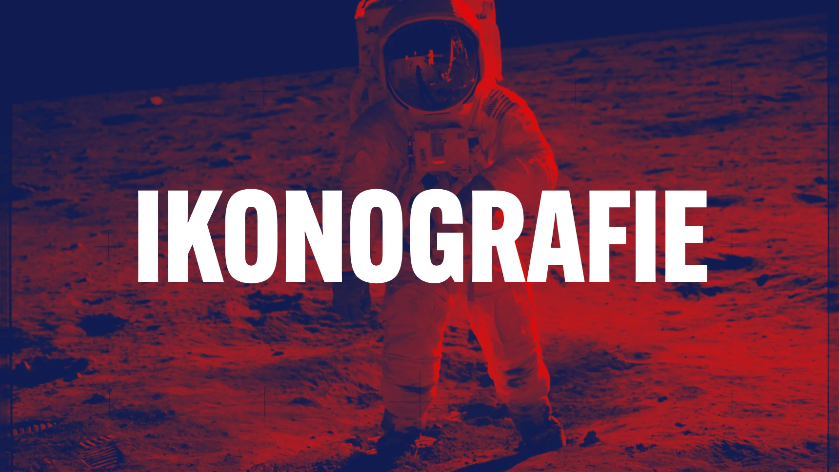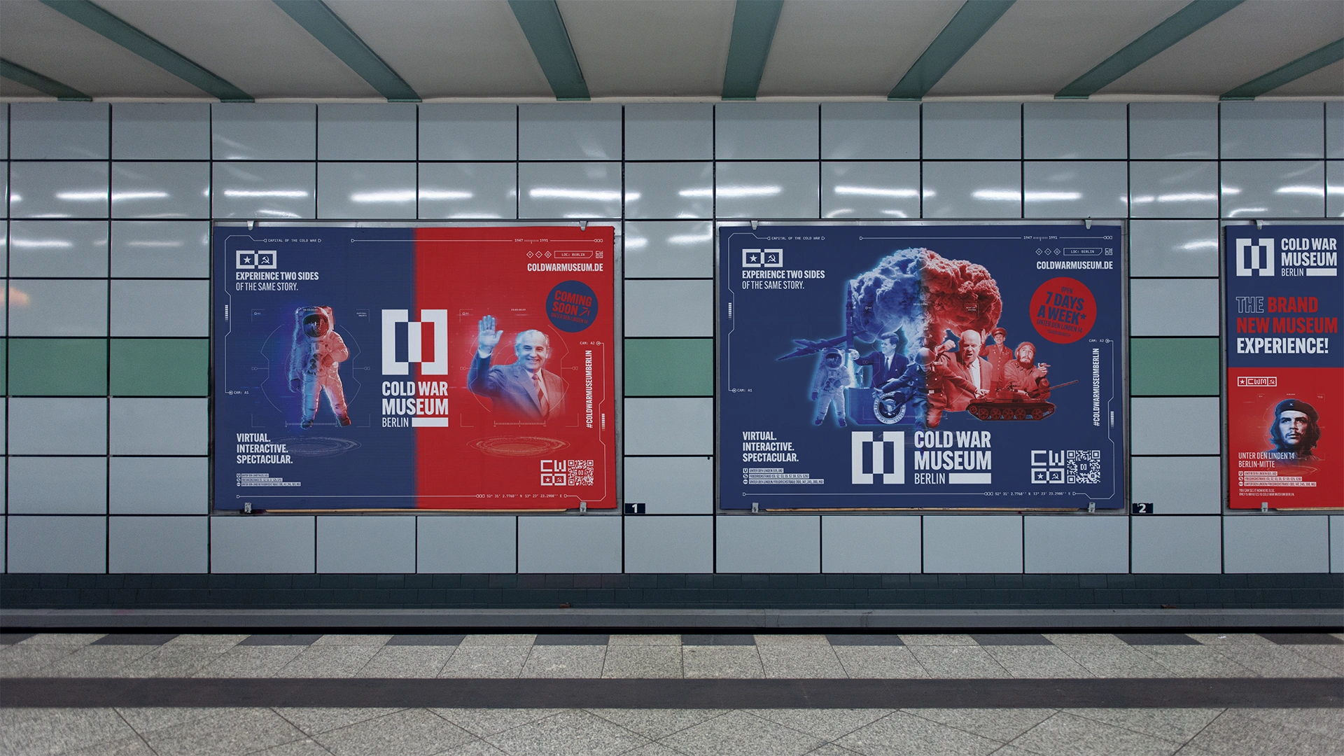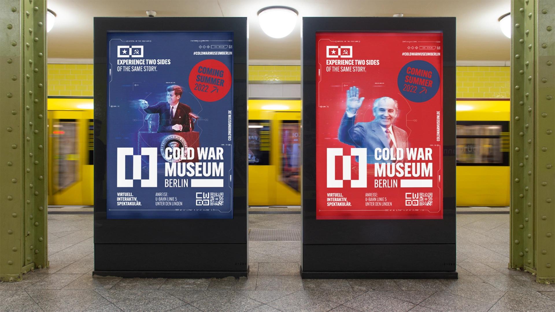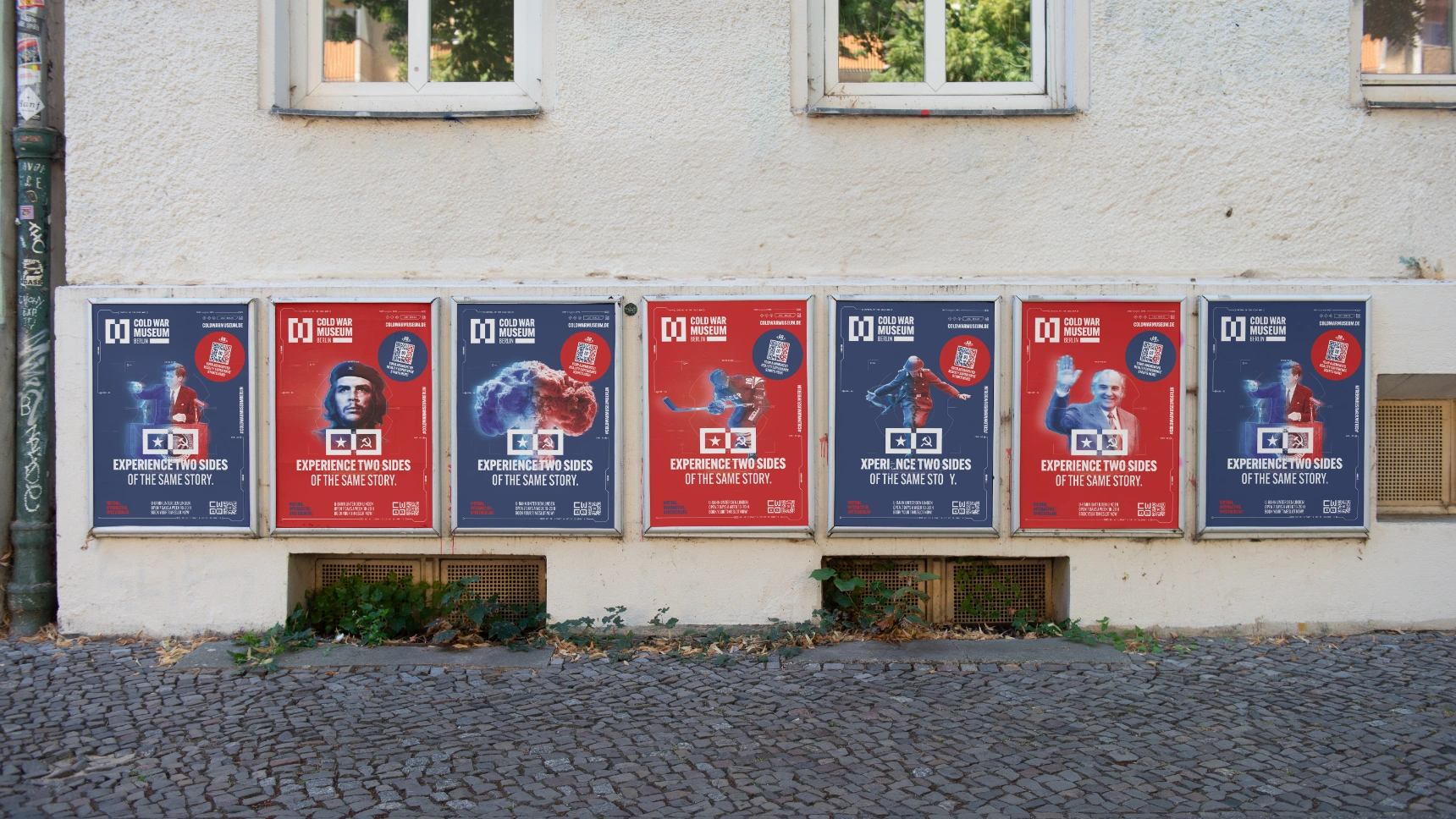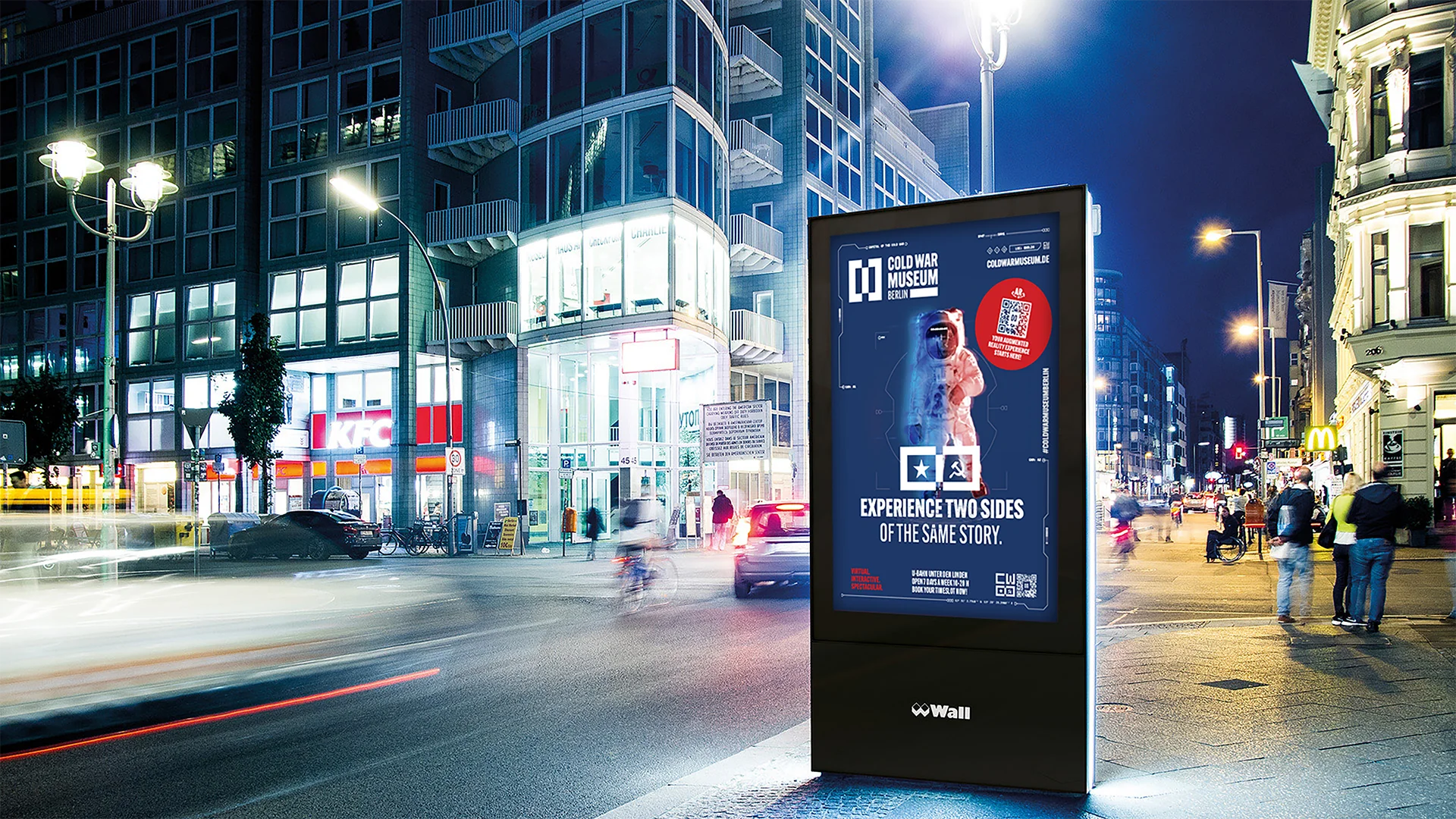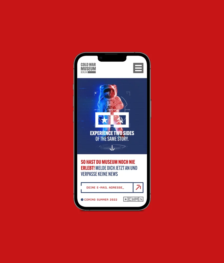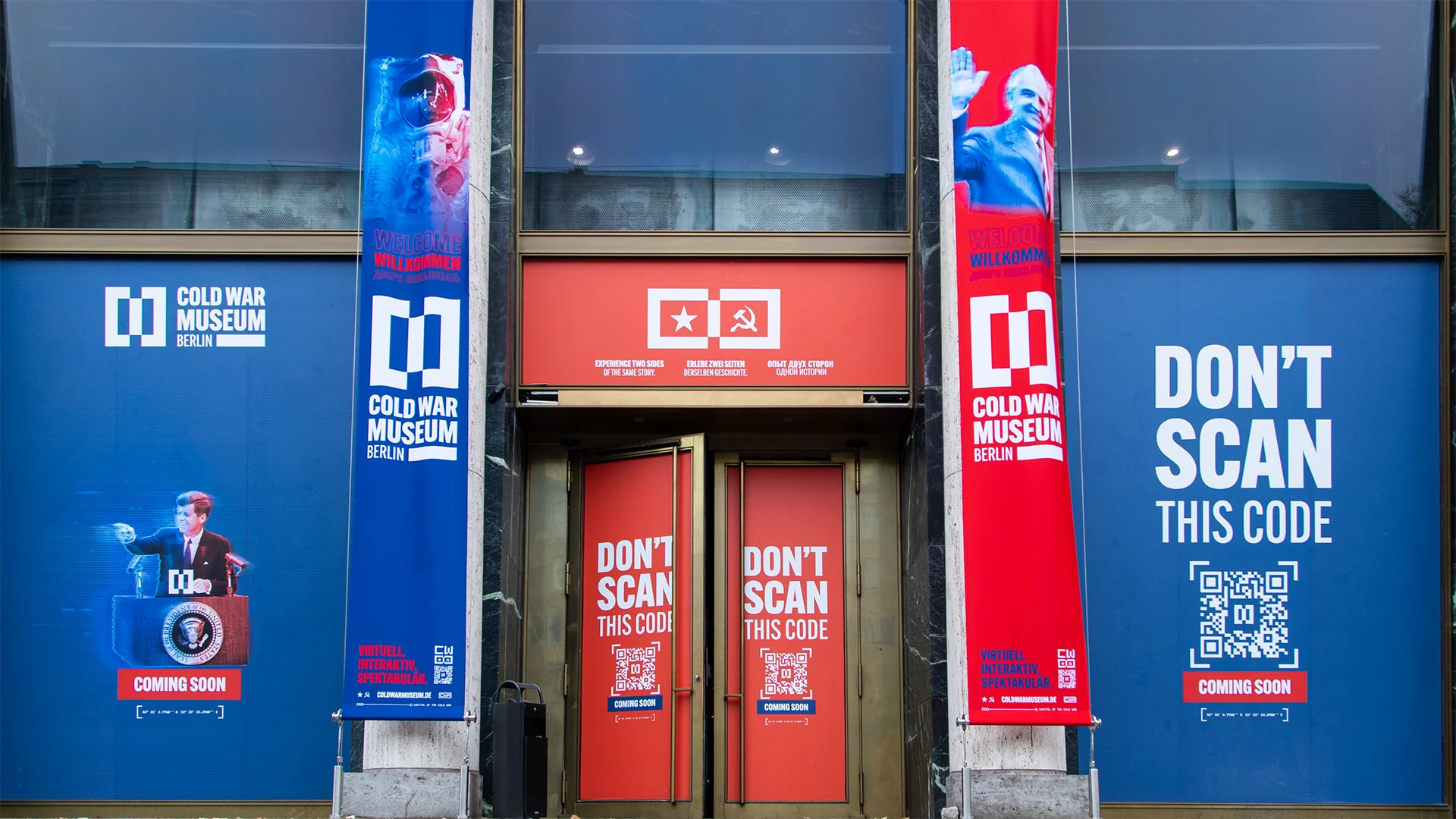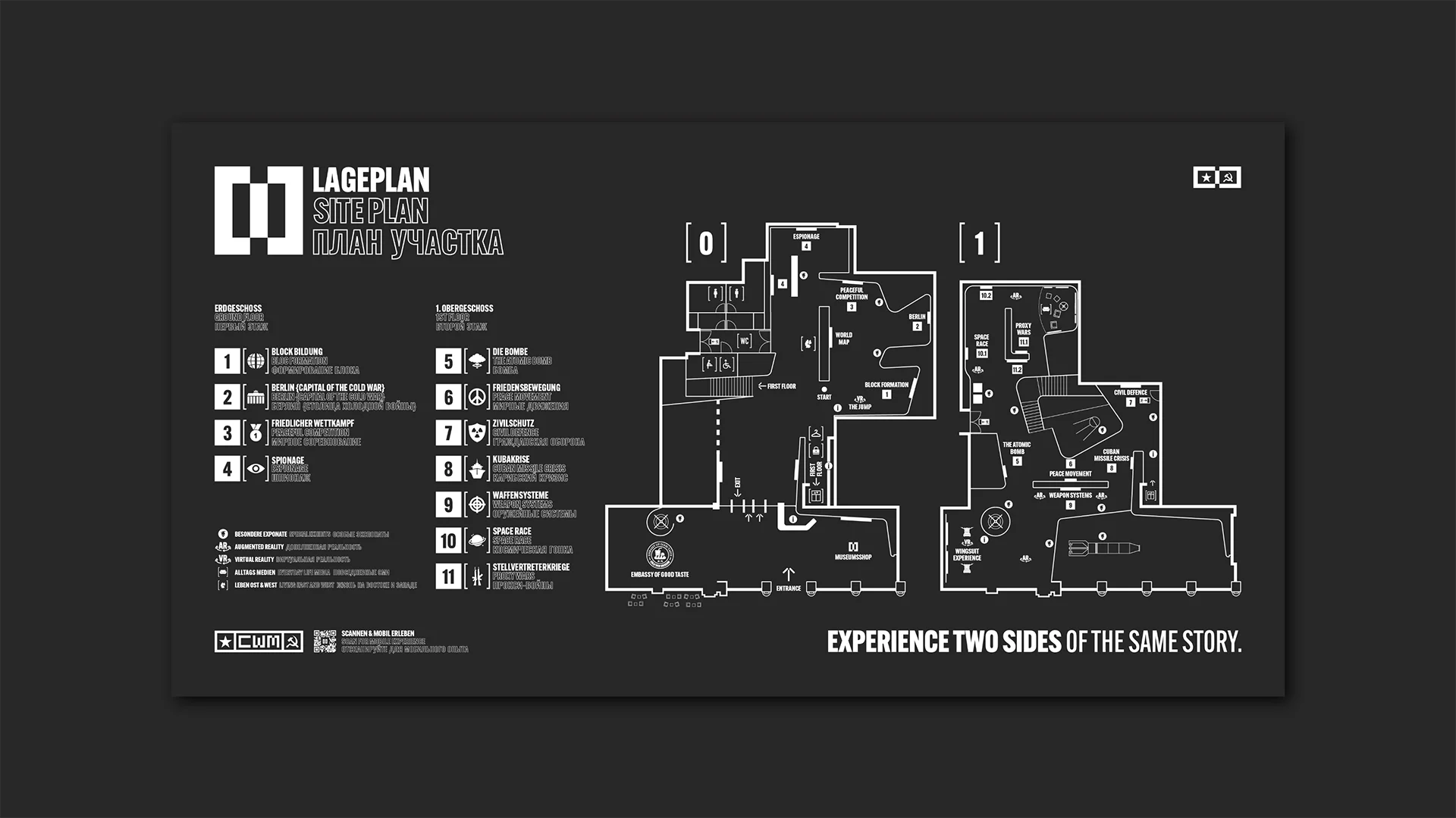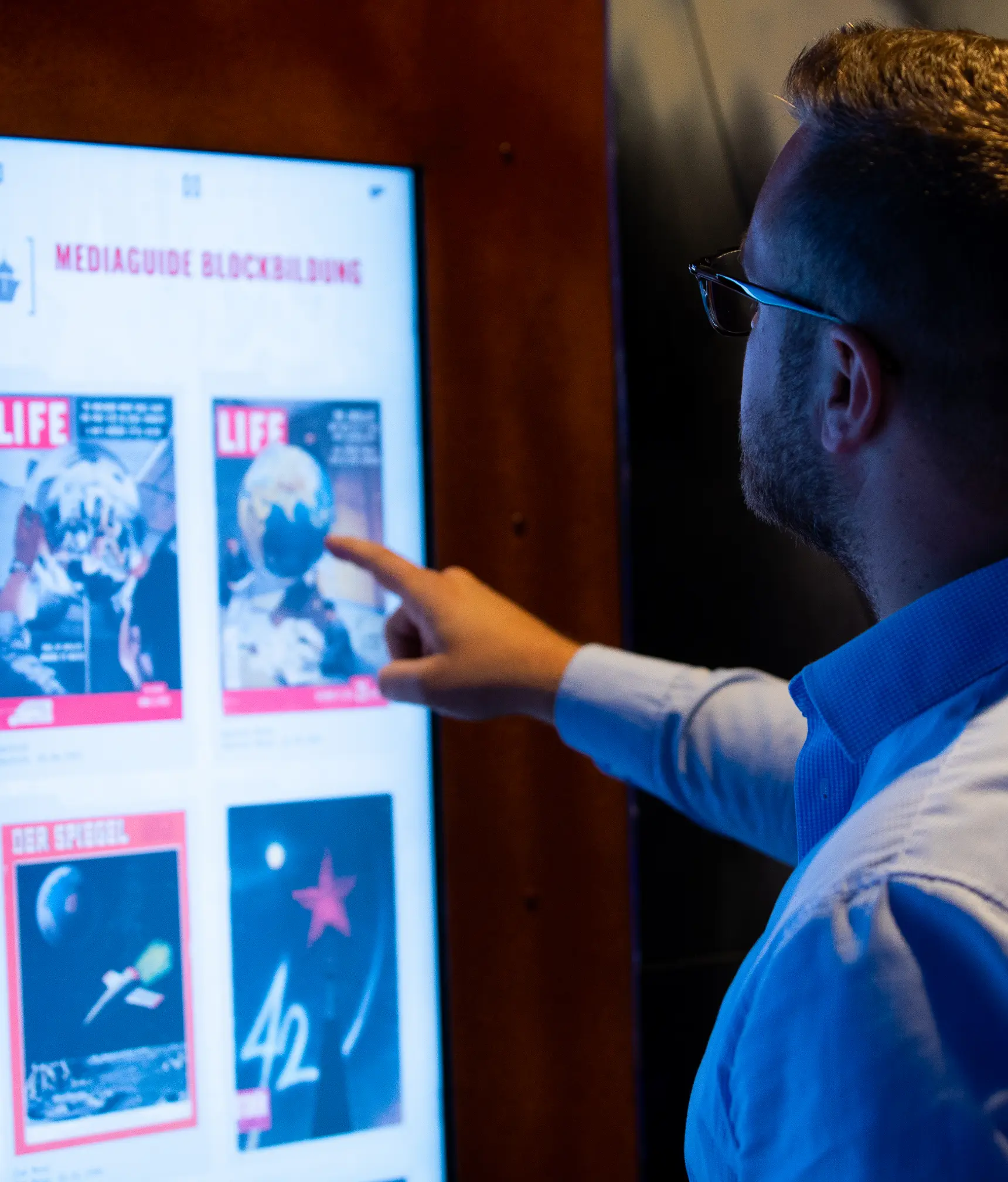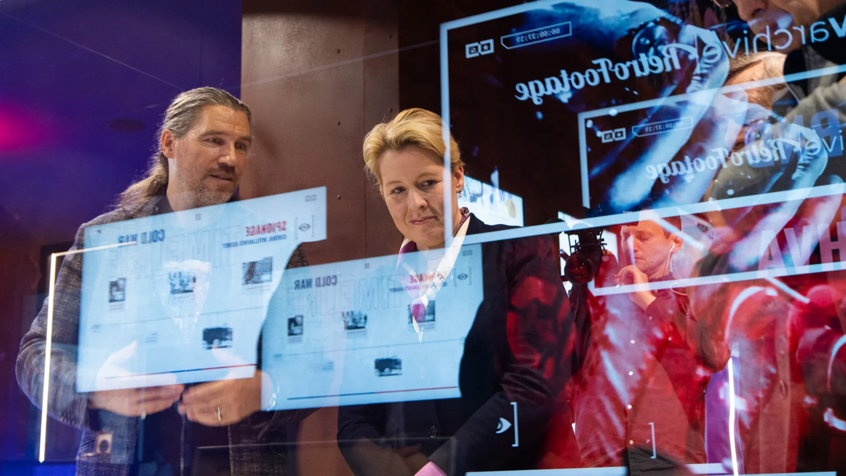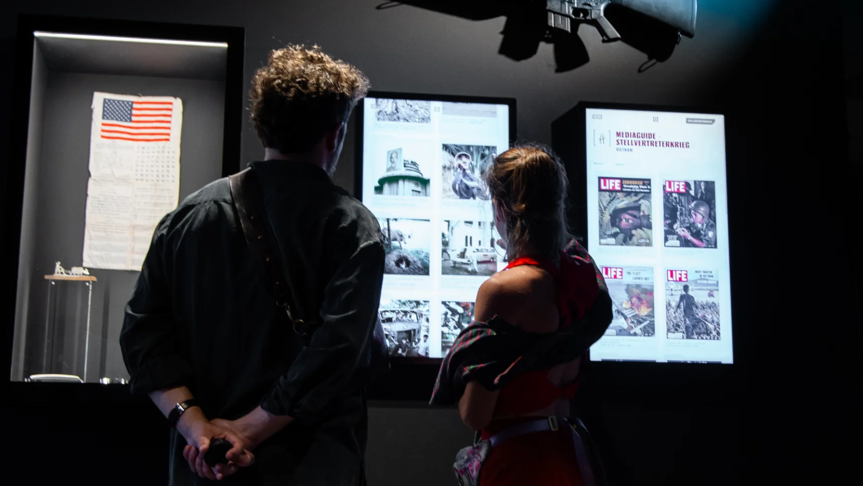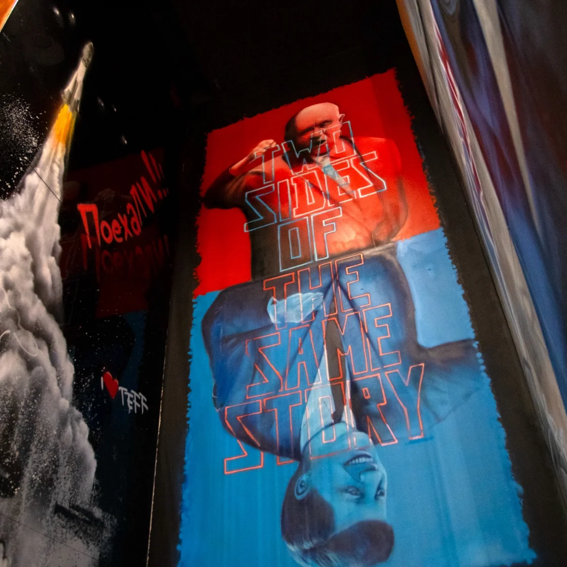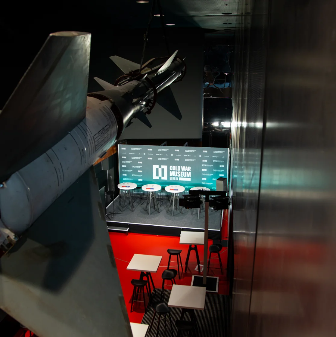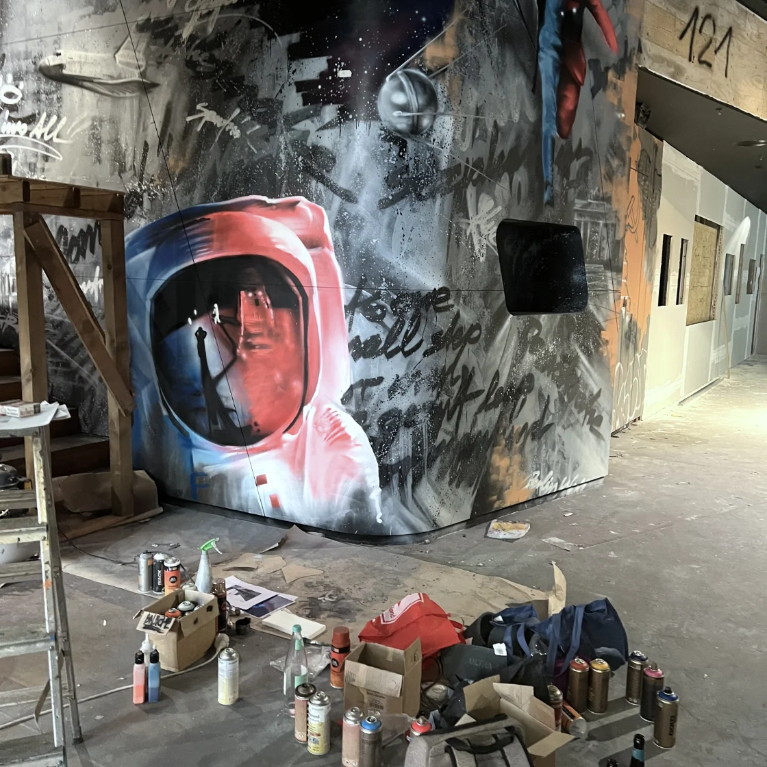


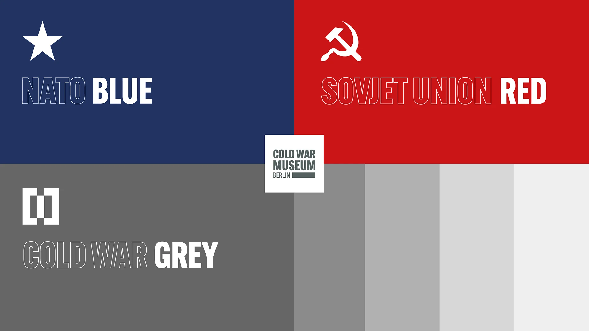
Branding for the Cold War Museum Berlin: The complementary color scheme of NATO Blue and Soviet Union Red reflects the balance of the exhibition. The logo design, divided by a vertical wall, brings this balance to life.

On the one hand, the tagline conveys the museum’s experiential approach; on the other, it promises neutrality in presenting the historical narrative of both sides of the Cold War. The “Cold War Museum” brand brings history to life—clearly, boldly, and with conviction.